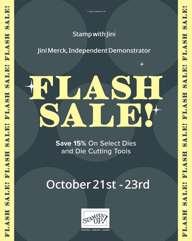
Take advantage of this Flash Sale prices for 3 Days!!! Flash Sale starts Wednesday, October 21st and ends Friday October 23rd
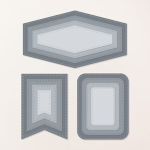
The 15% discount will apply to select dies and die cutting tools, which are only available while supplies last. See and shop all qualifying dies and die cutting tools in the online store.
Stop by my Online Store today get your favorite items too!
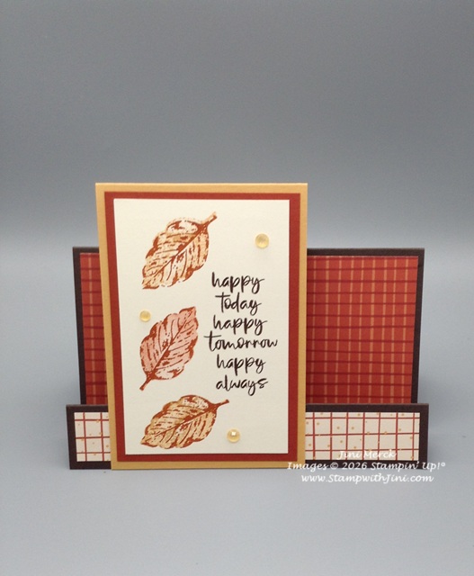
Today’s card was created for a friend to send fall birthday wishes. I wanted to create something that she could place on her mantel so I chose a fun fold, Faux Step Card.
Done in rich fall colors this card was easy to create with a few score lines and stamping off technique.
I’ve used the Sunflower Fields Designer Series Paper (168351) to inspire my color choices for this project. I love the way Designer Series Paper helps us coordinate colors for my projects quickly and easily simply by choosing a favorite sheet from the package.
Would you like to see how I created this Faux Step Card? If so, here is a quick video tutorial for you along with my PDF that contains the link, supply list, and of course measurements too!
Elegant Leaves Trio Faux Step Card PDF
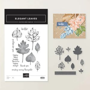
If you haven’t seen this stamp set, the Elegant Leaves stamp set (168300) is part of a money saving Bundle and contains some lovely all occasions sentiments like this one.
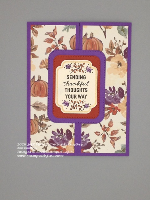
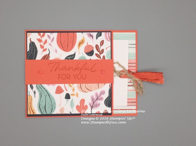
Fall has arrived and the cooler weather is settling in now that it’s mid October which always means the holidays are right around the corner. So today I’m sharing with you a fun Gate Fold Card as a wonderful way of sharing thankful thoughts with someone special.
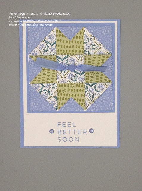
With cold & flu season right around the corner I thought this clever card might be just the thing to make someone feel better. After all, who doesn’t love to be cuddled under a quilt when they are feeling under the weather?
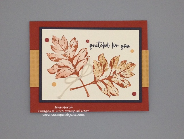
Looking for a fun fall card to say thank you to that someone special? The Elegant Leaves stamp set (168300) might be just the thing you’re looking for to create wonderful projects inspired by falls colors.
And if you love options it’s part of a Bundle that has coordinating Dies too! Making it a lot of fun to work with and gives you tons of options for creating.
Today’s card tutorial focuses on a simple stamping technique, called stamping off. This technique is a great way to get several shades of color from a single ink pad and create wonderful tone on tone images too.
As you can see I’ve done a tone on tone leave and my second leaf uses two different colors pulling in the warm In Color, Golden Glow which I just knew would be wonderful for my projects this autumn when I first saw it.
Want to see how I created this card? I’ve whipped up a quick video tutorial for you along with a PDF that contains a supply list and measurements.
And don’t forget to stop back by next week. While I will be enjoying some time with my daughter I’ve scheduled some things I wanted to share with you while I am away.
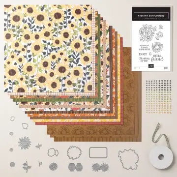
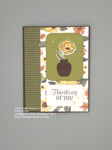
Fall, brings rich warm colors to the landscape along with those wonderful fall flowers. Today’s card uses the Sunflower Fields Suite (168365)
that is filled with those rich colors and images.
Check out today’s card that let’s that special someone know you’re thinking about them.
The fun little Early Espresso vase is one of the fun die cut shapes found in the bundle and it’s been filled with a warm Golden Glow flower that has had color added to it with our Stampin’ Blends.
The sentiment repeats that Early Espresso and has been cut out using an old favorite of mine, the Nested Essentials Dies (161597).
If you don’t have this set of Nested Essential Dies that has been used for this project you’ll want to check them out. I think you’ll find it a really wonderfully versatile set to have on hand as it is filled with some great basic shapes that you can layer.
Why not stop by my Online Store and check out this and other wonderful products that are available for your crafting need. And be sure to check out the Last Chance section, with Tuesday’s update of the Last Chance List you’ll find some wonderful deals too.
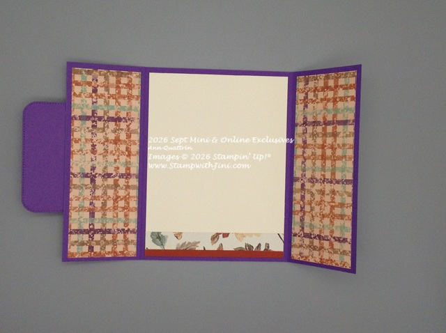
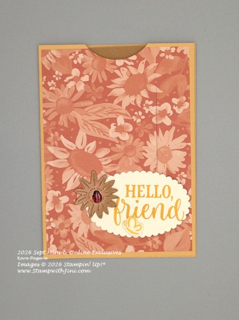
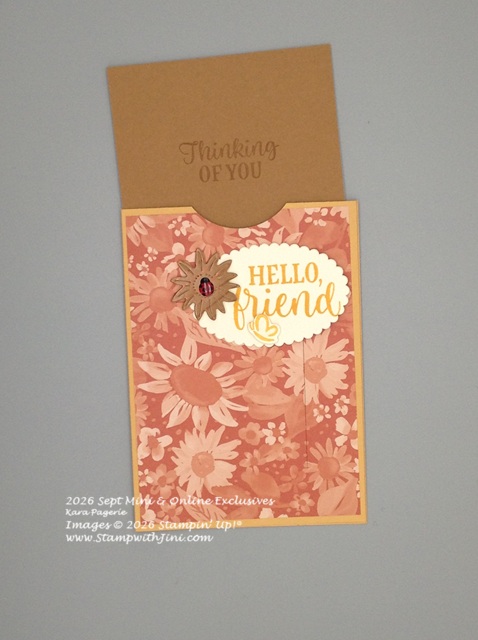
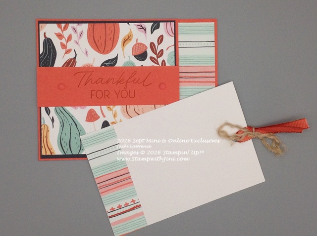
and you’ll reveal this fun little pull out card to place your message on.
How was this card made? It’s a typical card base made a bit shorter but scored the same – so you’ll use a 4 1/4″ x 9 3/4″ card base scored at 5 1/2″. Decorate the back of the inside. Then add a strip of our Tear & Tape along the top and the bottom edges of the card front and adhere. The pull out card measures 3 1/4″ x 5″ and slips easily into the pocket. I do recommend you use a Thick Basic White for this or card stock so it moves easily and doesn’t flex as much.
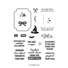
Don’t you love how our products work so well together? If you haven’t seen this Framed & Fabulous Stamp set (Online Exclusive 170573) it’s a versatile one using a beautiful font that is part of a Bundle in our NEW Hot Foil line of products.
And as you can see you don’t have to have the Hot Foil system to enjoy the stamp sets that are part of the Hot Foil bundles.
Why not stop by my Online Store and see all the fun new products like this stamp set?
It’s the first Tuesday in October and that means Stampin’ Up! has New Kits & the Product of the Month going LIVE today. In addition the Last Chance has been refreshed too!
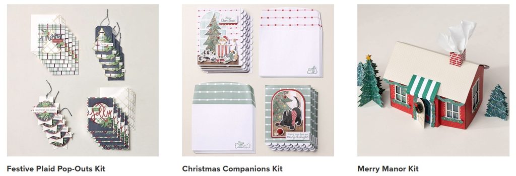
Three great NEW Kits to choose from went live today
These kits will make your holiday crafting super easy and fun.
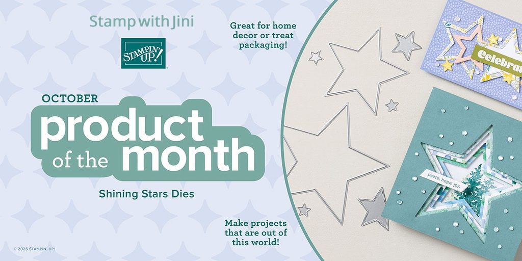
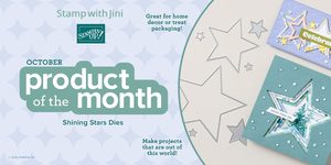
October’s Product of the Month – Shining Star Dies is Live
This set of dies is sure to be a hit!!! You’ll want to be sure to get your Shining Star Dies before they’re gone!
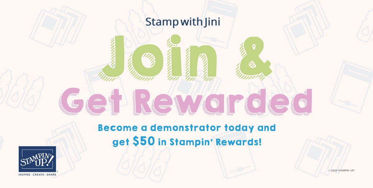
And finally if you have a long wish list why not join my team? With the October Join Now Promotion there is no better time to save.
New demonstrators who sign up between October 6 to 31 will get $50 in Stampin’ Rewards in addition to their $125 coupon code!
15–20% product discount
exclusive early access to the latest releases and catalogs
connection to a global community of crafters
Events
If you feel this is a good time to join Stampin’ Up! and my team, the Blue Mountain Stampers, you too can be first to receive early access and catalogs too!
What are the Blue Mountain Stampers?
That’s the name of our stamping community. I enjoy welcoming new members to our group. We’re from all over. If you’re considering joining Stampin’ Up!, you may have questions about how I would support you as part of my team. I do offer a variety of ways to learn, grow and to have FUN as a Blue Mountain Stamper!
Exclusive Team Resource Page – videos, PDFs and more
Exclusive Face book Group – A great way to share and connect with other team members and share
Swapping Opportunities
Team Retreats
Meetings – both local and online/virtual
Recognition & Incentives
Training available for workshops, clubs, classes and more!
Additional support and business coaching available